React Native Tutorial
- React Native Tutorial
- React Native Environment Setups
- React Native First Application Hello World
- React Native View
- React Native State
- React Native Props
- React Native Style
- React Native Height and Width
- React Native Button
- React Native Layout and Flexbox
- React Native Positioning Element with Flex
- React Native ScrollView
- React Native ListView
- React Native FlatList
- React Native SectionList
- React Native Touchables
- React Native Text Input
- React Native ActivityIndicator
- React Native Picker
- React Native StatusBar
- React Native Switch
- React Native WebView
- React Native ProgressBarAndroid
- React Native ProgressBar With Animated
Navigation
- React Native Navigation
- React Native Configuring Header Bar
- React Native Moving Between Screens
- React Native Passing Value between Screen
- React Native Tab Navigation
- React Native Adding Icons at the Bottom of Tab Navigation
- React Native Create Material Bottom Tab Navigator
- React Native Top Tab Navigator
- React Native Drawer Navigation
Storage
React Misc
- React Native Google Map
- React Native Modal
- React Native Vector Icons
- React Native Splash Screen
- React Native vs. Ionic
- React Native vs. Xamarin
- React Native vs Flutter
- React Native vs React
- React Native vs Swift
- Box shadow in React Native
- React Native IAP
- React-Native Localization
- React Native Toast
- React Native Sound
React Native Switch
React Native Switch is a Boolean control component which sets its value to true or false. It has an onValueChange callback method that updates its value prop. If the value prop is not changed, the Switch component continues supplied the value prop instead of the expected result of any user actions.
Props of Switch
| Props | Description |
|---|---|
| disabled | It is a Boolean property, if it is set to true then it cannot be toggled to switch. Its default value is false. |
| trackColor | It is used to customize the color for switch track. |
| ios_backgroundColor | It set the custom background color in iOS. The background can be visible either when the switch value is disabled or when the switch is false. |
| onValueChange | It invoked when the switch value is changed. |
| testID | It is used to locate this view in end-to-end tests. |
| thumbColor | It colors the foreground switch grip. When it is set to iOS, the switch grip will lose its drop shadow. |
| tintColor | It sets the border color on iOS and background color on Android when the switch is turned off. This property is deprecated; use trackColor at the place of it. |
| value | It is the value of switch. When it is set to true, it turns on. The default value is false. |
React Native Switch Example
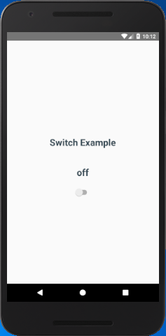
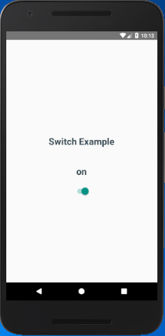
In this example, we initialy set the Switch value to false and display a Text with 'off'. When the value of Switch change to true by calling onValueChange the Text component is reset to 'on'.
App.js
import React, { Component } from 'react'
import {StyleSheet, Switch, View, Text} from 'react-native'
export default class SwitchExample extends Component {
state = {
switchValue: false
};
render() {
return (
<View style={styles.container}>
<Text style={styles.textStyle}>Switch Example</Text>
<Text style={styles.textStyle}>{this.state.switchValue ? 'on' :'off'}</Text>
<Switch
value={this.state.switchValue}
onValueChange ={(switchValue)=>this.setState({switchValue})}/>
</View>
);
}
}
const styles = StyleSheet.create ({
container: {
flex: 1,
alignItems: 'center',
justifyContent: 'center',
},
textStyle:{
margin: 24,
fontSize: 25,
fontWeight: 'bold',
textAlign: 'center',
color: '#344953'
}
})
Output:


