React Native Picker
React Native Picker is component which is used to select an item from the multiple choices. This is the same as a Dropdown option. Picker is used when we need to provide an alternative to choose from multiple options.
It is used by importing the Picker component from the react-native library.
Props of Picker
| Prop | Description |
|---|---|
| onValueChange( itemValue, itemPosition) | It is a callback prop and called when an item is selected. It takes two parameters (itemValue: the item (value) which is selected, itemPosition: the position (index) of a selected item). |
| selectedValue | Returns the selected value. |
| style | It is a picket style type. |
| testID | It is used to locate this view in end-to-end tests. |
| enabled | It is a Boolean prop which makes picker disable when set to false. If it is set to false, the user cannot be able to make a selection. |
| mode | On Android, it specifies how to display the selections items when the users click on the picker. It has the "dialog" and "dropdown" properties. The dialog is default mode and shows as a modal dialog. The dropdown displays the picker as dropdown anchor view. |
| prompt | It is used in Android with dialog mode as the title of the dialog. |
| itemStyle | It styles each item of the picker labels. |
React Native Picker Example
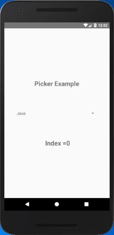
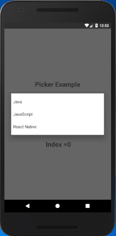
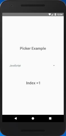
In this example, we create three label items in Picker component. When the item is selected from Picker, it calls the onValueChange callback and set the selected item in the picker. The index of item is read from itemPosition. The item's position is displayed in a Text component.
App.js
import React, { Component } from 'react'
import {StyleSheet,View, Text,Picker} from 'react-native'
export default class SwitchExample extends Component {
state = {
choosenIndex: 0
};
render() {
return (
<View style={styles.container}>
<Text style={styles.textStyle}>Picker Example</Text>
<Picker style={styles.pickerStyle}
selectedValue={this.state.language}
onValueChange={(itemValue, itemPosition) =>
this.setState({language: itemValue, choosenIndex: itemPosition})}
>
<Picker.Item label="Java" value="java" />
<Picker.Item label="JavaScript" value="js" />
<Picker.Item label="React Native" value="rn" />
</Picker>
<Text style={styles.textStyle}> {"Index ="+this.state.choosenIndex}</Text>
</View>
);
}
}
const styles = StyleSheet.create ({
container: {
flex: 1,
alignItems: 'center',
justifyContent: 'center',
},
textStyle:{
margin: 24,
fontSize: 25,
fontWeight: 'bold',
textAlign: 'center',
},
pickerStyle:{
height: 150,
width: "80%",
color: '#344953',
justifyContent: 'center',
}
})
Output: