React Native Tutorial
- React Native Tutorial
- React Native Environment Setups
- React Native First Application Hello World
- React Native View
- React Native State
- React Native Props
- React Native Style
- React Native Height and Width
- React Native Button
- React Native Layout and Flexbox
- React Native Positioning Element with Flex
- React Native ScrollView
- React Native ListView
- React Native FlatList
- React Native SectionList
- React Native Touchables
- React Native Text Input
- React Native ActivityIndicator
- React Native Picker
- React Native StatusBar
- React Native Switch
- React Native WebView
- React Native ProgressBarAndroid
- React Native ProgressBar With Animated
Navigation
- React Native Navigation
- React Native Configuring Header Bar
- React Native Moving Between Screens
- React Native Passing Value between Screen
- React Native Tab Navigation
- React Native Adding Icons at the Bottom of Tab Navigation
- React Native Create Material Bottom Tab Navigator
- React Native Top Tab Navigator
- React Native Drawer Navigation
Storage
React Misc
- React Native Google Map
- React Native Modal
- React Native Vector Icons
- React Native Splash Screen
- React Native vs. Ionic
- React Native vs. Xamarin
- React Native vs Flutter
- React Native vs React
- React Native vs Swift
- Box shadow in React Native
- React Native IAP
- React-Native Localization
- React Native Toast
- React Native Sound
React Native Modal
The React Native Modal is a type of View component which is used to present the content above an enclosing view. There are three different types of options (slide, fade and none) available in a modal that decides how the modal will show inside the react native app.
The Modal shows above the screen covers all the application area. To use the Modal component in our application, we need to import Modal from the react-native library.
Modal Props
| Props | Description |
|---|---|
| visible | This prop determines whether your modal is visible. |
| supportedOritentions | It allow for rotating the modal in any of the specified orientations (portrait, portrait-upside-down, landscape, landscape-left, landscape-right). |
| onRequestClose | This is a callback prop which is called when the user taps on the hardware back button on Android or the menu button on Apple TV. |
| onShow | This allows passing a function which will show when the modal once visible. |
| transparent | It determines whether the modal will cover the entire view. Setting it to "true" renders the modal over the transparent background. |
| animationType | It controls how the modal animates. There are three types of animated props available: slide: It slides the modal from the bottom. fade: It fades into the view. none: It appears the model without any animation. |
| hardwareAccelerated | It controls whether to force hardware acceleration for the underlying window. |
| onDismiss | This prop passes a function that will be called once the modal has been dismissed. |
| onOrientationChange | This props is called when the orientation changes while the modal is being displayed. The type of orientation is "portrait" or "landscape". |
| presentationStyle | It controls the appearance of a model (fullScreen, pageSheet, fromSheet, overFullScreen) generally on the large devices. |
| animated | This prop is deprecated. Use the animatedType prop instead, which is discussed above. |
React Native Modal Example
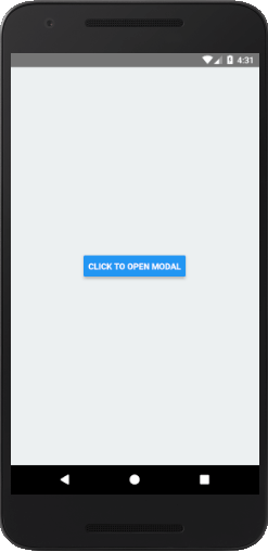
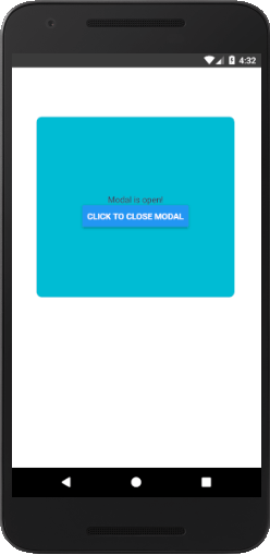
Let's see an example of displaying a pop-up modal on clicking the button. Once we clicked the button, state variable isVisible sets to true and opens the Modal component.
To implement the Modal component import Modal from the react-native library.
App.js
import React, {Component} from 'react';
import {Platform, StyleSheet, Text, View, Button, Modal} from 'react-native';
export default class App extends Component {
state = {
isVisible: false, //state of modal default false
}
render() {
return (
animationType = {"fade"}
transparent = {false}
visible = {this.state.isVisible}
onRequestClose = {() =>{ console.log("Modal has been closed.") } }>
{/*All views of Modal*/}
Modal is open!
{
this.setState({ isVisible:!this.state.isVisible})}}/>
{/*Button will change state to true and view will re-render*/}
title="Click To Open Modal"
onPress = {() => {this.setState({ isVisible: true})}}
/>
);
}
}
const styles = StyleSheet.create({
container: {
flex: 1,
alignItems: 'center',
justifyContent: 'center',
backgroundColor: '#ecf0f1',
},
modal: {
justifyContent: 'center',
alignItems: 'center',
backgroundColor : "#00BCD4",
height: 300 ,
width: '80%',
borderRadius:10,
borderWidth: 1,
borderColor: '#fff',
marginTop: 80,
marginLeft: 40,
},
text: {
color: '#3f2949',
marginTop: 10
}
});
Output:


