React Native Tutorial
- React Native Tutorial
- React Native Environment Setups
- React Native First Application Hello World
- React Native View
- React Native State
- React Native Props
- React Native Style
- React Native Height and Width
- React Native Button
- React Native Layout and Flexbox
- React Native Positioning Element with Flex
- React Native ScrollView
- React Native ListView
- React Native FlatList
- React Native SectionList
- React Native Touchables
- React Native Text Input
- React Native ActivityIndicator
- React Native Picker
- React Native StatusBar
- React Native Switch
- React Native WebView
- React Native ProgressBarAndroid
- React Native ProgressBar With Animated
Navigation
- React Native Navigation
- React Native Configuring Header Bar
- React Native Moving Between Screens
- React Native Passing Value between Screen
- React Native Tab Navigation
- React Native Adding Icons at the Bottom of Tab Navigation
- React Native Create Material Bottom Tab Navigator
- React Native Top Tab Navigator
- React Native Drawer Navigation
Storage
React Misc
- React Native Google Map
- React Native Modal
- React Native Vector Icons
- React Native Splash Screen
- React Native vs. Ionic
- React Native vs. Xamarin
- React Native vs Flutter
- React Native vs React
- React Native vs Swift
- Box shadow in React Native
- React Native IAP
- React-Native Localization
- React Native Toast
- React Native Sound
React Native Layout and Flexbox
React Native Flexbox is an algorithm to specify the layout of component's children. It provides a consistent layout on different screen sizes.
Property of Flexbox
Flexbox provides three main properties to achieve the desired layout. These properties are: flexDirection, justifyContent, and alignItems.
| Property | Values | Description |
|---|---|---|
| flexDirection | 'column', 'row' | Used to align its elements vertically or horizontally. |
| justifyContent | 'center', 'flex-start', 'flex-end', 'space-around', 'space-between' | Used to distribute the elements inside the container. |
| alignItems | 'center', 'flex-start', 'flex-end', 'stretched' | Used to distribute the element inside the container along the secondary axis (opposite to flexDirection). |
React Native Flex Direction
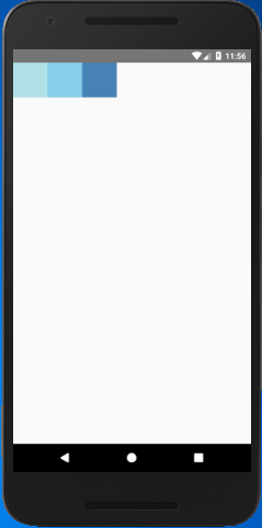
The flexDirection adds the style to the component in a primary axis of its layout. It has a property row and column to organize children horizontally and vertically respectively. The default flexDirection is a column.
import { StyleSheet,View } from 'react-native';
export default class FlexDirectionBasics extends Component {
render() {
return (
<View style={styles.container}>
<View style={styles.powderblue} />
<View style={styles.skyblue} />
<View style={styles.steelblue} />
</View>
);
}
}
const styles = StyleSheet.create({
container:{
flex: 1,
flexDirection: 'row',// set elements horizontally, try column.
},
powderblue:{
width: 60,
height: 60,
backgroundColor: 'powderblue',
},
skyblue:{
width: 60,
height: 60,
backgroundColor: 'skyblue',
},
steelblue:{
width: 60,
height: 60,
backgroundColor: 'steelblue',
}
})
Output

React Native Justify Content
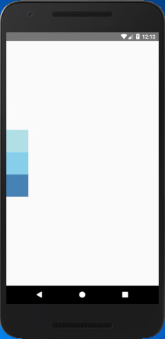
The justifyContent determines the distribution of children component along the primary axis. The children component are distributed at the start, end, center, or space evenly.
import { StyleSheet,View } from 'react-native';
export default class JustifyContentBasics extends Component {
render() {
return (
<View style={styles.container}>
<View style={styles.powderblue} />
<View style={styles.skyblue} />
<View style={styles.steelblue} />
</View>
);
}
}
const styles = StyleSheet.create({
container:{
flex: 1,
flexDirection: 'column', // set elements horizontally`.
justifyContent: 'center',
},
powderblue:{
width: 60,
height: 60,
backgroundColor: 'powderblue'
},
skyblue:{
width: 60,
height: 60,
backgroundColor: 'skyblue',
},
steelblue:{
width: 60,
height: 60,
backgroundColor: 'steelblue',
}
})
Output

React Native Align Items
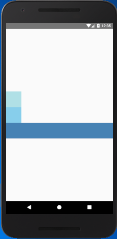
The alignItems determine the alignment of children component along the secondary axis. If the primary axis is a column, then the secondary is a row, and when a primary axis is a row, then the secondary is a column. Using the alignItems, the children are aligned at start, end, center, or stretched.
import { StyleSheet,View } from 'react-native';
export default class AlignItemsBasics extends Component {
render() {
return (
<View style={styles.container}>
<View style={styles.powderblue} />
<View style={styles.skyblue} />
<View style={styles.steelblue} />
</View>
);
}
}
const styles = StyleSheet.create({
container:{
flex: 1,
flexDirection: 'column', // set elements horizontally`.
justifyContent: 'center',
alignItems: 'stretch',
},
powderblue:{
width: 60,
height: 60,
backgroundColor: 'powderblue'
},
skyblue:{
width: 60,
height: 60,
backgroundColor: 'skyblue',
},
steelblue:{
/*width: 60,*/
height: 60,
backgroundColor: 'steelblue',
}
})
Output


