React Native Tutorial
- React Native Tutorial
- React Native Environment Setups
- React Native First Application Hello World
- React Native View
- React Native State
- React Native Props
- React Native Style
- React Native Height and Width
- React Native Button
- React Native Layout and Flexbox
- React Native Positioning Element with Flex
- React Native ScrollView
- React Native ListView
- React Native FlatList
- React Native SectionList
- React Native Touchables
- React Native Text Input
- React Native ActivityIndicator
- React Native Picker
- React Native StatusBar
- React Native Switch
- React Native WebView
- React Native ProgressBarAndroid
- React Native ProgressBar With Animated
Navigation
- React Native Navigation
- React Native Configuring Header Bar
- React Native Moving Between Screens
- React Native Passing Value between Screen
- React Native Tab Navigation
- React Native Adding Icons at the Bottom of Tab Navigation
- React Native Create Material Bottom Tab Navigator
- React Native Top Tab Navigator
- React Native Drawer Navigation
Storage
React Misc
- React Native Google Map
- React Native Modal
- React Native Vector Icons
- React Native Splash Screen
- React Native vs. Ionic
- React Native vs. Xamarin
- React Native vs Flutter
- React Native vs React
- React Native vs Swift
- Box shadow in React Native
- React Native IAP
- React-Native Localization
- React Native Toast
- React Native Sound
React Native Create Material Bottom Tab Navigator
he material style provides an extra designing effect to tab bar at the bottom of screen. The material design makes you to switch among the different screens. The tab screen components are not mounted until the screens are first focused.
To use the material design navigator, install react-navigation-material-bottom-tabs library as:
- npm install react-navigation-material-bottom-tabs react-native-paper
This library uses the BottomNavigation component from react-native-paper.
It is also require to install react-native-vector-icons.
- createMaterialBottomTabNavigator(RouteConfigs, MaterialBottomTabNavigatorConfig);
Example to Create Material Bottom Tab Navigation
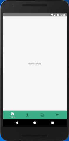
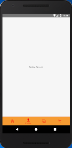
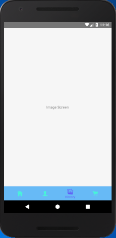
In this example, we implement the material bottom tab navigator to highlights the active tab's icons and its title. The rest of tab display only icon without the title. To use material designs, import the createMaterialBottomTabNavigator function from react-navigation-material-bottom-tabs library.
App.js
import {StyleSheet, Text, View,Button} from 'react-native';
import { createBottomTabNavigator, createAppContainer} from 'react-navigation';
import { createMaterialBottomTabNavigator } from 'react-navigation-material-bottom-tabs';
import Icon from 'react-native-vector-icons/Ionicons';
class HomeScreen extends React.Component {
render() {
return (
<View style={styles.container}>
<Text>Home Screen</Text>
</View>
);
}
}
class ProfileScreen extends React.Component {
render() {
return (
<View style={styles.container}>
<Text>Profile Screen</Text>
</View>
);
}
}
class ImageScreen extends React.Component {
render() {
return (
<View style={styles.container}>
<Text>Image Screen</Text>
</View>
);
}
}
class CartScreen extends React.Component {
render() {
return (
<View style={styles.container}>
<Text>Cart Screen</Text>
</View>
);
}
}
const styles = StyleSheet.create({
container: {
flex: 1,
justifyContent: 'center',
alignItems: 'center'
},
});
const TabNavigator = createMaterialBottomTabNavigator(
{
Home: { screen: HomeScreen,
navigationOptions:{
tabBarLabel:'Home',
tabBarIcon: ({ tintColor }) => (
<View>
<Icon style={[{color: tintColor}]} size={25} name={'ios-home'}/>
</View>),
}
},
Profile: { screen: ProfileScreen,
navigationOptions:{
tabBarLabel:'Profile',
tabBarIcon: ({ tintColor }) => (
<View>
<Icon style={[{color: tintColor}]} size={25} name={'ios-person'}/>
</View>),
activeColor: '#f60c0d',
inactiveColor: '#f65a22',
barStyle: { backgroundColor: '#f69b31' },
}
},
Image: { screen: ImageScreen,
navigationOptions:{
tabBarLabel:'History',
tabBarIcon: ({ tintColor }) => (
<View>
<Icon style={[{color: tintColor}]} size={25} name={'ios-images'}/>
</View>),
activeColor: '#615af6',
inactiveColor: '#46f6d7',
barStyle: { backgroundColor: '#67baf6' },
}
},
Cart: {
screen: CartScreen,
navigationOptions:{
tabBarLabel:'Cart',
tabBarIcon: ({ tintColor }) => (
<View>
<Icon style={[{color: tintColor}]} size={25} name={'ios-cart'}/>
</View>),
}
},
},
{
initialRouteName: "Home",
activeColor: '#f0edf6',
inactiveColor: '#226557',
barStyle: { backgroundColor: '#3BAD87' },
},
);
export default createAppContainer(TabNavigator);
Output:


