React Native Tutorial
- React Native Tutorial
- React Native Environment Setups
- React Native First Application Hello World
- React Native View
- React Native State
- React Native Props
- React Native Style
- React Native Height and Width
- React Native Button
- React Native Layout and Flexbox
- React Native Positioning Element with Flex
- React Native ScrollView
- React Native ListView
- React Native FlatList
- React Native SectionList
- React Native Touchables
- React Native Text Input
- React Native ActivityIndicator
- React Native Picker
- React Native StatusBar
- React Native Switch
- React Native WebView
- React Native ProgressBarAndroid
- React Native ProgressBar With Animated
Navigation
- React Native Navigation
- React Native Configuring Header Bar
- React Native Moving Between Screens
- React Native Passing Value between Screen
- React Native Tab Navigation
- React Native Adding Icons at the Bottom of Tab Navigation
- React Native Create Material Bottom Tab Navigator
- React Native Top Tab Navigator
- React Native Drawer Navigation
Storage
React Misc
- React Native Google Map
- React Native Modal
- React Native Vector Icons
- React Native Splash Screen
- React Native vs. Ionic
- React Native vs. Xamarin
- React Native vs Flutter
- React Native vs React
- React Native vs Swift
- Box shadow in React Native
- React Native IAP
- React-Native Localization
- React Native Toast
- React Native Sound
React Native Button
Most users interact with mobile through touches. There are combinations of gestures that work on it, such as tapping on the button, zooming the map, scrolling a list, etc. A button is one of the components that work on its click.
React Native Button is a basic component that works by clicking on it. It imports the Button class of react-native.
Props of Button
| Prop | Type | Required | Description |
|---|---|---|---|
| onPress | function | yes | Call the handler when user clicks the button. |
| title | string | yes | Display the text inside the button. |
| accessibilityLabel | string | no | Display the text for blindness accessibility features. |
| color | Color | no | Set the background color of the Android button or set the color of iOS text. |
| disabled | bool | no | It disables all interactions for this component, if true. |
| textID | string | no | Used to locate this view in end-to-end tests. |
| hasTVPreferredFocus | bool | no | It preferred TV focus work only for Apple TV. |
React Native Button Example
In this example, we will work on the button component. React Native Button component imports the Button class of react-native library. It has several props such as title, onPress, accessibilityLabel, etc. which are mentioned above.
In the previous article Positioning Element with Flex, we learned how to position elements in View.
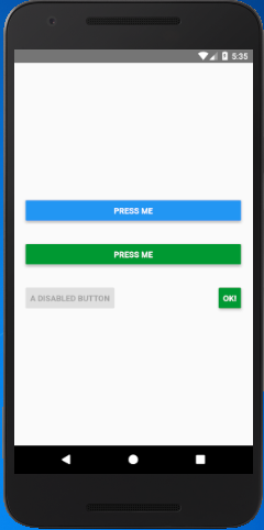
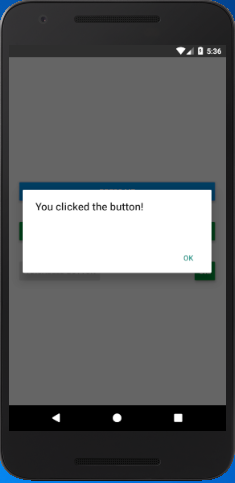
In the below code the title prop sets the title of a button, onPress prop calls the mention function and performs an event. The color prop sets the color of the button, and disabled={true} makes the button to disable.
import { Alert, AppRegistry, Button, StyleSheet, View } from 'react-native';
export default class ButtonBasics extends Component {
onPressButton() {
Alert.alert('You clicked the button!')
}
render() {
return (
<View style={styles.container}>
<View style={styles.buttonContainer}>
<Button
onPress={this.onPressButton}
title="Press Me"
/>
</View>
<View style={styles.buttonContainer}>
<Button
onPress={this.onPressButton}
title="Press Me"
color="#009933"
/>
</View>
<View style={styles.multiButtonContainer}>
<Button
onPress={this.onPressButton}
title="A disabled button"
disabled={true}
/>
<Button
onPress={this.onPressButton}
title="OK!"
color="#009933"
/>
</View>
</View>
);
}
}
const styles = StyleSheet.create({
container: {
flex: 1,
justifyContent: 'center',
},
buttonContainer: {
margin: 20
},
multiButtonContainer: {
margin: 20,
flexDirection: 'row',
justifyContent: 'space-between'
}
})
Output:


