Flutter Tutorial
Dart Programming
Flutter Basics
Flutter Widgets
- Flutter Scaffold
- Flutter Container
- Flutter Row and Column
- Flutter Text
- Flutter TextField
- Flutter Buttons
- Flutter Stack
- Flutter Forms
- Flutter Alert Dialogs
- Flutter Icons
- Flutter Images
- Flutter Card
- Flutter Tabbar
- Flutter Drawer
- Flutter Lists
- Flutter GridView
- Flutter Toast Notification
- Flutter Checkbox
- Flutter Radio Button
- Flutter Progress Bar
- Flutter Snackbar
- Flutter Tooltip
- Flutter Slider
- Flutter Switch
- Flutter Charts
- Flutter Bottom Navigation Bar
- Flutter Themes
- Flutter Table
- Flutter Calendar
- Flutter Animation
Flutter Routing
Advanced Concepts
Flutter Differences
Flutter Interview Questions
Flutter Progress Bar
A progress bar is a graphical control element used to show the progress of a task such as downloading, uploading, installation, file transfer, etc. In this section, we are going to understand how to show a progress bar in a flutter application.
Flutter can display the progress bar with the help of two widgets, which are given below:
- LinearProgressIndicator
- CircularProgressIndicator
Let us understand it in detail.
LinearProgressIndicator
The linear progress bar is used to show the progress of the task in a horizontal line.
Flutter provides mainly two types of linear progress indicators:
Determinate: Determinate progress bar indicates the actual amount of progress at each point in making the task. Its value will increase monotonically from 0.0 to 1.0 to show the amount of task completed at that time. We need to use a non-null value from 0.0 to 1.0 for creating a determinate progress indicator.
Indeterminate: Indeterminate progress bar does not indicate the amount of progress in completing the task. It means we do not know when the task is finished. It makes progress without indicating how much progress remains. We can make an indeterminate progress indicator by using a null value.
Properties
The following are the most common attributes of linear progress indicator:
double value: It is used to specify the non-null value between 0.0 to 1.0, representing the completion of task progress.
Color backgroundColor: It is used to specify the background color of the widget.
Animation<Color> valueColor: It is used to specify the progress indicator's color as an animated value.
Example
The following code explains the use of an indeterminate linear progress bar that shows a download where we do not know when it will be finished. A floating button is used to change the state from not downloading to downloading. When there is no downloading, it shows a text; otherwise, it will show the progress indicator:
void main() => runApp(MyApp());
class MyApp extends StatelessWidget {
@override
Widget build(BuildContext context) {
return MaterialApp(
home: LinearProgressIndicatorApp(),
);
}
}
class LinearProgressIndicatorApp extends StatefulWidget {
@override
State<StatefulWidget> createState() {
return LinearProgressIndicatorAppState();
}
}
class LinearProgressIndicatorAppState extends State<LinearProgressIndicatorApp> {
bool _loading;
@override
void initState() {
super.initState();
_loading = false;
}
@override
Widget build(BuildContext context) {
return Scaffold(
appBar: AppBar(
title: Text("Flutter Linear Progress Bar"),
),
body: Center(
child: Container(
padding: EdgeInsets.all(12.0),
child: _loading ? LinearProgressIndicator() : Text(
"Press button for downloading",
style: TextStyle(fontSize: 25)),
),
),
floatingActionButton: FloatingActionButton(
onPressed: () {
setState(() {
_loading = !_loading;
});
},
tooltip: 'Download',
child: Icon(Icons.cloud_download),
),
);
}
}
Output:
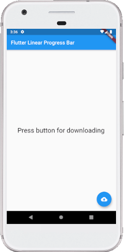
Now, run the app in your IDE. We can see the UI of the screen as below screenshot.
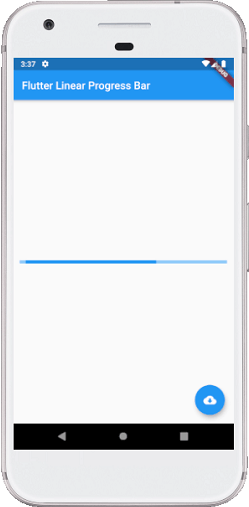
When we press the floating button, it changes the state from not downloading to downloading and shows the progress indicator like the below screenshot:
Sometimes we want to make a determinate progress bar that means we will show how long it will take time to finish the task. In that case, we can simulate a download that will take time to finish the task and updates the value of LinearProgressIndicator as follows:
import 'package:flutter/material.dart';
void main() => runApp(MyApp());
class MyApp extends StatelessWidget {
@override
Widget build(BuildContext context) {
return MaterialApp(
home: LinearProgressIndicatorApp(),
);
}
}
class LinearProgressIndicatorApp extends StatefulWidget {
@override
State<StatefulWidget> createState() {
return LinearProgressIndicatorAppState();
}
}
class LinearProgressIndicatorAppState extends State<LinearProgressIndicatorApp> {
bool _loading;
double _progressValue;
@override
void initState() {
super.initState();
_loading = false;
_progressValue = 0.0;
}
@override
Widget build(BuildContext context) {
return Scaffold(
appBar: AppBar(
title: Text("Flutter Linear Progress Bar"),
),
body: Center(
child: Container(
padding: EdgeInsets.all(12.0),
child: _loading
? Column(
mainAxisAlignment: MainAxisAlignment.center,
children: <Widget>[
LinearProgressIndicator(
backgroundColor: Colors.cyanAccent,
valueColor: new AlwaysStoppedAnimation<Color>(Colors.red),
value: _progressValue,
),
Text('${(_progressValue * 100).round()}%'),
],
)
: Text("Press button for downloading", style: TextStyle(fontSize: 25)),
),
),
floatingActionButton: FloatingActionButton(
onPressed: () {
setState(() {
_loading = !_loading;
_updateProgress();
});
},
tooltip: 'Download',
child: Icon(Icons.cloud_download),
),
);
}
// this function updates the progress value
void _updateProgress() {
const oneSec = const Duration(seconds: 1);
new Timer.periodic(oneSec, (Timer t) {
setState(() {
_progressValue += 0.1;
// we "finish" downloading here
if (_progressValue.toStringAsFixed(1) == '1.0') {
_loading = false;
t.cancel();
return;
}
});
});
}
}
Output:
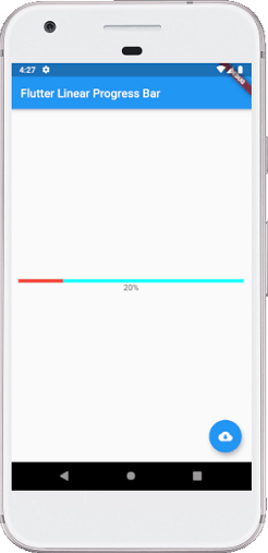
Now, run the app in your IDE. When we press the button, it changes the state from not downloading to downloading and shows how much progress is finished at that time like the below screenshot:
CircularProgressIndicator
It is a widget, which spins to indicate the waiting process in your application. It shows the progress of a task in a circular shape. It also displays the progress bar in two ways: Determinate and Indeterminate.
A determinate progress bar is used when we want to show the progress of ongoing tasks such as the percentage of downloading or uploading files, etc. We can show the progress by specifying the value between 0.0 and 1.0.
An indeterminate progress bar is used when we do not want to know the percentage of an ongoing process. By default, CircularProgressIndicator shows the indeterminate progress bar.
Example
In the below example, we will see the circular progress indicator in an indeterminate mode that does not show any task's progress. It displays the circles continuously, which indicates that something is being worked out, and we have to wait for its completion. For this, there is no need to specify any value to the CircularProgressIndicator() constructor. See the following code:
void main() => runApp(MyApp());
class MyApp extends StatelessWidget {
@override
Widget build(BuildContext context) {
return MaterialApp(
home: Scaffold(
appBar: AppBar(
title: Text('Flutter Progress Bar Example'),
),
body: Center(
child: CircularProgressIndicatorApp()
),
),
);
}
}
/// This is the stateless widget that the main application instantiates.
class CircularProgressIndicatorApp extends StatelessWidget {
@override
Widget build(BuildContext context) {
return CircularProgressIndicator(
backgroundColor: Colors.red,
strokeWidth: 8,);
}
}
Output:
Now, run the app in your IDE. We will see the output of the flutter circular progress indicator like the below screenshot:
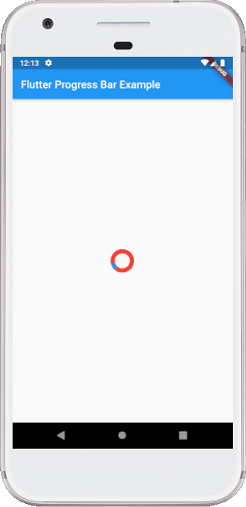
Sometimes you want to make a determinate circular progress bar to show how much it will take time to finish the task. In that case, we can simulate a download that will take time to finish the task and updates the value of CircularProgressIndicator as follows:
import 'package:flutter/material.dart';
void main() => runApp(MyApp());
class MyApp extends StatelessWidget {
@override
Widget build(BuildContext context) {
return MaterialApp(
home: CircularProgressIndicatorApp(),
);
}
}
class CircularProgressIndicatorApp extends StatefulWidget {
@override
State<StatefulWidget> createState() {
return CircularProgressIndicatorAppState();
}
}
class CircularProgressIndicatorAppState extends State<CircularProgressIndicatorApp>{
bool _loading;
double _progressValue;
@override
void initState() {
super.initState();
_loading = false;
_progressValue = 0.0;
}
@override
Widget build(BuildContext context) {
return Scaffold(
appBar: AppBar(
title: Text("Flutter Circular Progress Bar"),
),
body: Center(
child: Container(
padding: EdgeInsets.all(14.0),
child: _loading
? Column(
mainAxisAlignment: MainAxisAlignment.center,
children: <Widget>[
CircularProgressIndicator(
strokeWidth: 10,
backgroundColor: Colors.yellow,
valueColor: new AlwaysStoppedAnimation<Color>(Colors.red),
value: _progressValue,
),
Text('${(_progressValue * 100).round()}%'),
],
)
: Text("Press button for downloading", style: TextStyle(fontSize: 25)),
),
),
floatingActionButton: FloatingActionButton(
onPressed: () {
setState(() {
_loading = !_loading;
_updateProgress();
});
},
child: Icon(Icons.cloud_download),
),
);
}
// this function updates the progress value
void _updateProgress() {
const oneSec = const Duration(seconds: 1);
new Timer.periodic(oneSec, (Timer t) {
setState(() {
_progressValue += 0.2;
// we "finish" downloading here
if (_progressValue.toStringAsFixed(1) == '1.0') {
_loading = false;
t.cancel();
return;
}
});
});
}
}
Output:
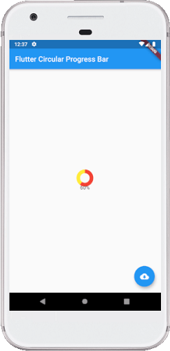
Now, run the app in your IDE. When we press the button, it shows how much progress is finished at that time like the below screenshot:
